06 Dec Are you wondering how to design a great website?
In this modern age of computers and the internet, there are a multitude of paths open to anyone who wants to build a website. Some are free and some aren’t.
Free or not, you still need to have a captivating design that will give your visitors a great impression of your website along with some really great and informative content.
The Layout
Deciding on how your website is laid out is probably the first and most important step you will take when setting up a website.
Is the navigation going to run horizontally across the top of the page or will it be vertically positioned along one of the sides? Do you want it to be a full-width design to run left to right and fill up everyone’s screen no matter the size of their hardware? What colour scheme will you use?
These questions are a few examples of what you should be asking yourself when designing your website.
Navigation
The benefits your navigation can provide a visitor are plentiful. It needs to be easy to find and easy to understand. Depending on how you’ve decided to lay out your content, a horizontal menu could be much easier to use. But the same goes for a vertical menu. It’s all very reliant on how your page looks overall.
Standard navigation on websites today seems to be a horizontally running menu at the top of your page. It’s up to you if you’d like it to appear above or below the header of your website. It could even run in-line with your header if you have a small logo.
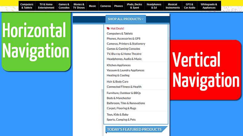
Demonstration of a horizontal menu VS. vertical navigation. In my opinion, the horizontal looks much more easy to use.
It’s incredibly important to keep your navigation simple as well. Keep your website split up into categories and sub-categories so visitors can navigate easily. If you want to place heaps of content on your website from all different genres, do your best to categorise your content into some main categories that can then have sub-categories intuitively placed underneath them. Also strive to keep your category names as un-wordy yet descriptive as possible.
Page Width
If your website is benefiting from a lot of HD, large images, then having a full-width design would be a good way to keep the rest of your design looking uniform. Full-width designs are usually a great way to keep them responsive and appear efficiently on smaller devices such as smart phones.
That being said, large images can also make a set-width design pop out, but make sure the whole thing is still responsive or has the capabilities to display a different version of the design that is suitable for viewing on smaller screened devices.
Colour Scheme
When choosing a colour scheme, try your best to keep it to three colours. Choose one colour to be your ‘primary’ colour and then two ‘complimentary’ colours. These should be the only colours you use when putting together your website’s design. Colour wheels can really help you decide on what you’re going to use.
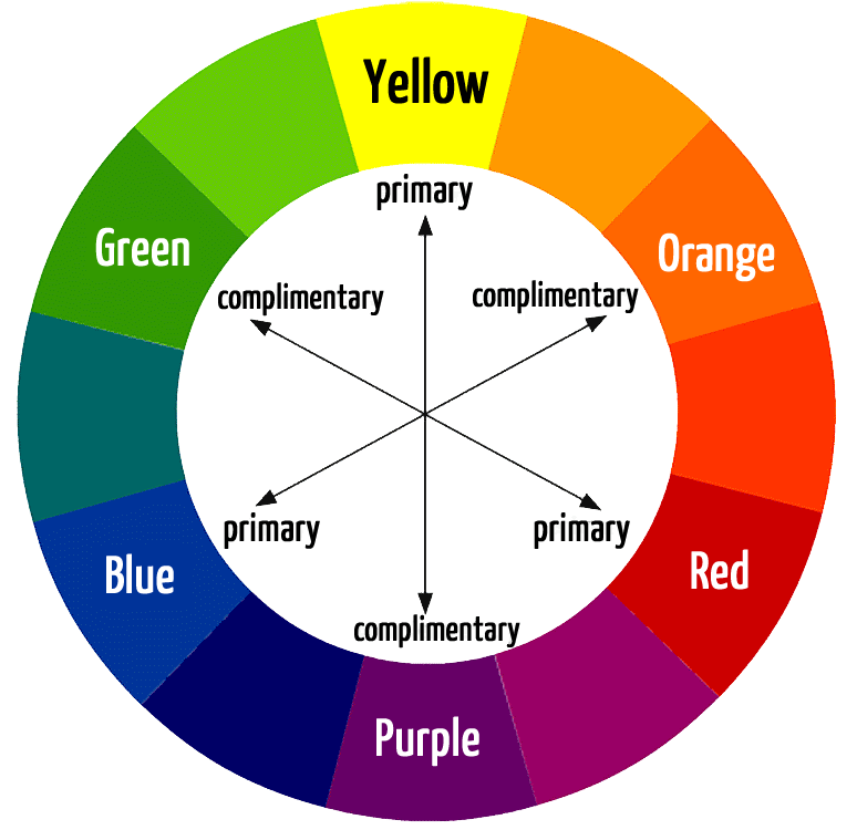
A colour wheel displaying how to find complimentary colours.
By using a colour wheel, you can more easily work out what colours compliment your primary colour. But in the end, it’s at your discretion what colours you use. Sometimes complimentary colours don’t really do your design justice. If you’re stuck for choice, there are some pretty great websites out there that provide you with colour schemes to browse through or create yourself.
Also you’re not solely confined to using only three colours. You can deviate and choose some different shades of the colours you’ve chosen as this still fits in with the rule of threes.
The Rule of Threes
Excerpt from Wikipedia – “The rule of three is a writing principle that suggests that things that come in threes are inherently funnier, more satisfying, or more effective than other numbers of things. The reader or audience of this form of text is also more likely to consume information if it is written in groups of threes.”
This concept can also be translated over to design. Generally when things are in threes it is more aesthetically pleasing. Take for example an advertisement you see on TV. The spruiker isn’t screaming at you to “BUY! BUY!” They’re more often than not spouting such phrases in threes and from constant exposure to such methods, it’s what our brains come to expect. Therefore most humans feel quite comfortable when seeing things in threes thus giving a design more of an attraction.
Graphics
It can be quite hard to create your own graphics that are not only pleasing to the eye, but also convey the message you want to people to receive when looking at them.
Software such as Adobe Photoshop can help you manipulate images so they become what you’re after. But if you don’t have the budget to fork out hundreds, if not thousands of dollars for such software, there are some great websites that provide similar software for free. One of which is actually a free browser based version of Photoshop itself. If you type the right search term into Google you’ll find something that suits your needs.
However, for those of you who’d prefer to have access to ready made images straight away, Google image search is a God-send. Just make sure you have permission to use such images before adding them to your website.
Content
I know, content isn’t part of the design. But then again, without great content, your beautiful masterpiece of a website design will be all for naught. Visitors only take a couple of seconds when visiting a website to know if they want to stay and read, or find something else.
Without informative and relevant content sitting on your Home page, you will more often than not lose that visitor who just clicked through to your website.
If you have any further questions about website design, or would like Live Link Websites to help with a design for your own website, please get in touch today.