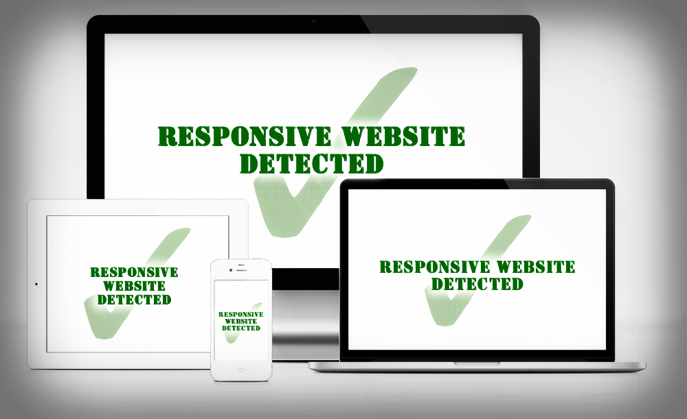
06 Dec Websites to Suit Mobile Technology
Over 80% of internet users own a smartphone. And the majority of those users will prefer to whip out their phone to look something up online instead of wait for a computer to start up.
Even if your website is purely there to give your business an online presence, when someone views it on their phone and it’s not responsive (another term to indicate mobile friendly websites), chances are it won’t look very nice. Worse than that, if your website content is scaled down to fit onto a phone screen, everything will become that much harder to read.
This will result in users getting frustrated and skipping to the next website. A website that is responsive.
My website is not responsive. What could go wrong?
Apart from potentially frustrating your customers and new users, Google are starting to punish website that aren’t user friendly.
As time goes on, more and more website will be mobile friendly. If your website doesn’t keep up with other mobile friendly competitors, Google will start to rank them higher than you.
What are the benefits of mobile friendly websites?
Due to the high percentage of smartphone users in the world, it will eventually become absolutely necessary for websites to be responsive.
However, besides the growing population of smartphone users, having a responsive website can also provide greater ease of use to your customers.
Take, for example, a car transfer service. Their customers aren’t always going to be beside a computer to make their bookings. They could be walking down the street, at a restaurant, at an airport etc. So when they use their smartphone to look for car transfers services, they will either want to find a website that legibly tells them a company’s phone number or better yet, provide them with an online booking form.
If your website provides a service similar to this but is not responsive, when a customer views your website, they will have to zoom in to their phone, hunt around the page by swiping their fingers here and there and sometimes, try to fill in a booking form that is too small to touch or just doesn’t support their kind of phone.
Internet speeds are growing and websites are loading much quicker than they ever have. An internet user will expect to find what they want on the internet very quickly. So if a website isn’t giving them what they want fast enough, internet users can easily and happily try the next website.
Don’t Let Your Business Lose Customers
If you already have a website but haven’t had it optimised to be mobile friendly and responsive, chances are it can be converted quite simply.
Alternatively, there are thousands of beautiful, modern, easy to use and responsive templates out there that can be configured to suit your business’ online needs.
If you need a new responsive website or an existing website converted to be mobile friendly, get in touch with Live Link Websites to see how we can help.